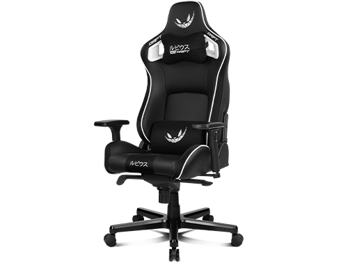
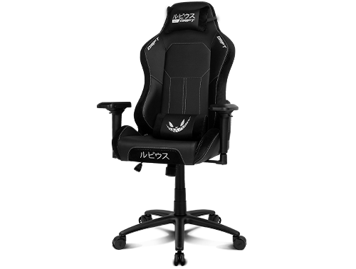
RUBIUS Gaming Chairs

RUBIUS GAMING CHAIRS

Art Direction & Graphic Design | 2021

CONTEXT

El Rubius is one of the most important influencers and creators of audiovisual entertainment content in the Spanish-speaking world. To make the most possible profit from his popularity, Rubius sells through his online store branded merchandising and apparel. But in 2020 he relied on Drift Gaming to develop his most complex product to that date: two gaming chairs, one of them launched as a limited edition product and both marketed as high-end products.

SOLUTION

Setting the visual design for these products involved unifying both Drift Gaming's and El Rubius' branding into one visual code. To do this, I based the project's lettering - as well as its visual design - on the logos and colour palettes of both brands, creating thus a simple yet vibrant aesthetic which made the products stand out to the fullest.

RUBIUS Feat. DRIFT GAMING | BRANDS' LOGOS


RUBIUS Feat. DRIFT GAMING | Products main logo


RUBIUS Feat. DRIFT GAMING | Rubius logo


RUBIUS Feat. DRIFT GAMING | Drift Gaming logo

RUBIUS Feat. DRIFT GAMING | BRANDS' COLORS


RUBIUS Feat. DRIFT GAMING | Rubius brand colors


RUBIUS Feat. DRIFT GAMING | Drift Gaming brand colors

RUBIUS Feat. DRIFT GAMING | PRODUCTS' LOGOS


RUBIUS Feat. DRIFT GAMING | Rubius Premium chair logo


RUBIUS Feat. DRIFT GAMING | Rubius Pro chair logo

The marketing strategy would be the same for both products: the creation of product landing pages with a link to an online shop, plus its dissemination through a strategy of organic posts on the main social networks, paid advertising in media and search engines and a press release sent to the specialised gaming media on each chair's launching day.

APPLICATIONS

PREMIUM CHAIR   |   PRO CHAIR

[PRODUCT LANDING PAGE]   |   [SOCIAL MEDIA PICTURES]   |   [GDN ASSETS]   |   [NEWSLETTER]

The visual codes for this product were set on a clean aesthetic, devised to bring all focus on the chair itself - its design and colours - plus its high-end details and cosntruction materials.

Rubius Premium product page (desktop version) | Quick demo (click on pic) | [visit product page]

Rubius Premium product page (mobile version) | Quick demo (click on pic) | [visit product page]

Rubius Premium | GDN ads (click on pic)

Rubius Premium | Newsletter for specialized media (click on pic)

PREMIUM CHAIR   |   PRO CHAIR

[PRODUCT LANDING PAGE]   |   [SOCIAL MEDIA PICTURES]   |   [GDN ASSETS]   |   [NEWSLETTER]

Neo Noir set the tone for this product's visual codes: such style - inspired in a retrofuturist revision of 90s and 00s visual culture - is at the core of many millennials, centennials and gaming communities visual and emotional universe.

Rubius Pro product page (desktop version) | Quick demo (click on pic) | [visit product page]

Rubius Pro product page (mobile version) | Quick demo (click on pic) | [visit product page]

Rubius Pro | GDN ads (click on pic)

Rubius Premium | Newsletter for specialized media (click on pic)

PROJECT
CREDITS

STAFF
Art direction Beatriz Luque, Alexis Cruzado
Brands treatment & adaptation into project's guidelines Alexis Cruzado
Products landings design Alexis Cruzado
Products landings & newsletters copywriting Marina G. Mérida
Marketing assets creation (SM & GDN pictures) Alexis Cruzado
Product photography Daniel Ortiz, Fran Pezzo
TOOLS
Brands lettering adaptation Adobe Illustrator
Pattern design Adobe Illustrator | Adobe Photoshop
Products landings design Bootstrap | Sublime Text | HTML5 | CSS3 | JavaScript
Newsletter design Adobe Photoshop | Sublime Text | HTML5
Marketing assets creation (SM & GDN pictures) Adobe Photoshop | Adobe After Effects
Products photos Adobe Lightroom | Adobe Photoshop

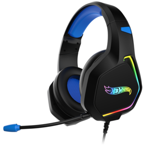
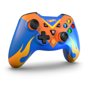
HOT WHEELS Gaming Collection

HOT WHEELS
GAMING COLLECTION

Art Direction & Graphic Design | 2021 - 2022

CONTEXT

Mattel, Inc. is the creator of some of the most iconic toys in history, as well as a company in a perpetual search for new market niches in which to offer its own products or those developed in collaboration with other companies, when a consumer audience eludes their scope. That is why, after focusing on the gaming niche, Mattel relied on Krom Gaming to develop a collection of peripherals branded with one of its flagship brands: Hot Wheels.

SOLUTION

Although there might be a spectrum of adult consumers interested in this collection, the main target audiences were pre-teens and teenage boys and girls. But first of all it was necessary to unify both brands into one. To do this, I based the project's lettering - as well as its visual design - on the logos and colour palettes of both brands, creating thus a simple yet vibrant aesthetic which made the products stand out to the fullest.

HOT WHEELS X KROM GAMING | BRANDS' LOGOS


HOT WHEELS X KROM GAMING | Krom Gaming logo


HOT WHEELS X KROM GAMING | Krom Gaming brand colors


HOT WHEELS X KROM GAMING | Hot Wheels logo


HOT WHEELS X KROM GAMING | Hot Wheels brand colors


HOT WHEELS X KROM GAMING | Collection's logo

HOT WHEELS X KROM GAMING | PRODUCTS' LOGOS


HOT WHEELS X KROM GAMING | Product logo: Krom Kustom


HOT WHEELS X KROM GAMING | Product logo: Krom Kanyon


HOT WHEELS X KROM GAMING | Product logo: Krom Key Pro

Based on these resources and a couple of patterns, I created the whole set of marketing applications for this project, from the product's landing pages, to the assets needed for their dissemination strategy through organic posts on the main social networks and on media and search engines' paid advertising spaces.

APPLICATIONS

To help pushing the furthest the offline and online diffusion of this collection of gaming peripherals, separated marketing comms applications were created for both the products individually and together, displayed as a collection.

PRODUCTS   |   COLLECTION

KROM KUSTOM   |   [KROM KANYON]   |   [KROM KEY PRO]

Krom Kustom product page (desktop version) | Quick demo (click on pic) | [visit product page]

Krom Kustom product page (mobile version) | Quick demo (click on pic) | [visit product page]

[KROM KUSTOM]   |   KROM KANYON   |   [KROM KEY PRO]

Krom Kanyon product page (desktop version) | Quick demo (click on pic) | [visit product page]

Krom Kanyon product page (mobile version) | Quick demo (click on pic) | [visit product page]

[KROM KUSTOM]   |   [KROM KANYON]   |   KROM KEY PRO

Krom Key Pro product page (desktop version) | Quick demo (click on pic) | [visit product page]

Krom Key Pro product page (mobile version) | Quick demo (click on pic) | [visit product page]

PRODUCTS   |   COLLECTION

In order to help advertising online this gaming perihperals collection, some studio photographs were taken displaying the products as an attractive setup placed in a neat environment. This set of aspirational pictures was used as the visual basis for a series of images created to be published on Mattel's and Krom Gaming's main social networks, in addition to its dissemination as paid advertisements banners, published in specialized media websites.

HOT WHEELS X KROM Collection | GDN ads (click on pic)

PROJECT
CREDITS

STAFF
Art direction Beatriz Luque, Alexis Cruzado
Brands treatment & adaptation into project's guidelines Alexis Cruzado
Products landings design Alexis Cruzado
Products landings copywriting Marina G. Mérida
Marketing assets creation (SM & GDN pictures) Alexis Cruzado
Product photography Daniel Ortiz, Fran Pezzo
TOOLS
Brands lettering adaptation Adobe Illustrator
Pattern design Adobe Illustrator | Adobe Photoshop
Products landings design Bootstrap | Sublime Text | HTML5 | CSS3 | JavaScript
Marketing assets creation (SM & GDN pictures) Adobe Photoshop | Adobe After Effects
Products photos Adobe Lightroom | Adobe Photoshop

BARBIE Gaming Collection

BARBIE
GAMING COLLECTION

Art Direction & Graphic Design | 2021 - 2022

CONTEXT

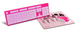
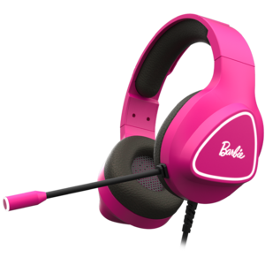
Mattel, Inc. is the creator of some of the most iconic toys in history, as well as a company in a perpetual search for new market niches in which to offer its own products or those developed in collaboration with other companies, when a consumer audience eludes their scope. That is why, after focusing on the gaming niche, Mattel relied on Krom Gaming to develop a collection of peripherals branded with one of its flagship brands: Barbie.

SOLUTION

Although there might be a spectrum of adult consumers interested in this collection, the main target audiences were pre-teens and teenage boys and girls. But first of all it was necessary to unify both brands into one. To do this, I based the project's lettering - as well as its visual design - on the logos and colour palettes of both brands, creating thus a simple yet vibrant aesthetic which made the products stand out to the fullest.

BARBIE X KROM GAMING | BRANDS' LOGOS


BARBIE X KROM GAMING | Krom Gaming logo


BARBIE X KROM GAMING | Krom Gaming brand colors


BARBIE X KROM GAMING | Barbie logo


BARBIE X KROM GAMING | Barbie brand colors


BARBIE X KROM GAMING | Collection's logo

BARBIE X KROM GAMING | PRODUCTS' LOGOS


BARBIE X KROM GAMING | Product logo: Krom Kandy


BARBIE X KROM GAMING | Product logo: Krom Khali

Based on these resources and a couple of patterns, I created the whole set of marketing applications for this project, from the product's landing pages, to the assets needed for their dissemination strategy through organic posts on the main social networks and on media and search engines' paid advertising spaces.

APPLICATIONS

To help pushing the furthest the offline and online diffusion of this collection of gaming peripherals, separated marketing comms applications were created for both the products individually and together, displayed as a collection.

PRODUCTS   |   COLLECTION

KROM KANDY   |   [KROM KHALI]

Krom Kandy product page (desktop version) | Quick demo (click on pic) | [visit product page]

Krom Kandy product page (mobile version) | Quick demo (click on pic) | [visit product page]

[KROM KANDY]   |   KROM KHALI

Krom Khali product page (desktop version) | Quick demo (click on pic) | [visit product page]

Krom Khali product page (mobile version) | Quick demo (click on pic) | [visit product page]

PRODUCTS   |   COLLECTION

In order to help advertising online this gaming perihperals collection, some studio photographs were taken displaying the products as an attractive setup placed in a neat environment. This set of aspirational pictures was used as the visual basis for a series of images created to be published on Mattel's and Krom Gaming's main social networks, in addition to its dissemination as paid advertisements banners, published in specialized media websites.

BARBIE X KROM Collection | GDN ads (click on pic)

PROJECT
CREDITS

STAFF
Art direction Beatriz Luque, Alexis Cruzado
Brands treatment & adaptation into project's guidelines Alexis Cruzado
Products landings design Alexis Cruzado
Products landings copywriting Marina G. Mérida
Marketing assets creation (SM & GDN pictures) Alexis Cruzado
Product photography Daniel Ortiz, Fran Pezzo
TOOLS
Brands lettering adaptation Adobe Illustrator
Pattern design Adobe Illustrator | Adobe Photoshop
Products landings design Bootstrap | Sublime Text | HTML5 | CSS3 | JavaScript
Marketing assets creation (SM & GDN pictures) Adobe Photoshop | Adobe After Effects
Products photos Adobe Lightroom | Adobe Photoshop

RAIN IN BAGDAD Motion Graphics

RAIN IN BAGDAD

Motion Graphics | 2016

CONTEXT

"Rain in Baghdad" was a short film directed by Pedro Terrero and Kike Ramírez, which says more than what it seems to and can fit in a few lines. This short film is an interesting and emotional sci-fi work on ordinary people, Eastern and Western cultures' differences, the loneliness of our elders and the rise and fall of a media hype. But, much above all, this project is about how small are we, as individuals and as species.

SOLUTION

In order to help Pedro and Kike telling this original story, I was assigned the creation of a motion graphics intro for a fictional Japanese TV show featured in the film, which I developed from a set of three keyframes, every of its elements then animated with After Effects.

APPLICATIONS

My work on this collaboration was completed in just one week, from its starting point as a set of three vector illustrations, to its combination and set in motion as an animated clip.

PROJECT BREAKDOWN

RAIN IN BAGDAD | Video [onclick]

PROJECT
CREDITS

STAFF
Art direction Pedro Terrero, Kike Ramírez, Biktor Kero
Illustration Alexis Cruzado
Motion graphics Alexis Cruzado
TOOLS
Illustration Adobe Illustrator
Motion graphics Adobe After Effects

NOLAPTOP FEST Project

NOLAPTOP FEST

Brand Design. Graphic Design & Illustration.Motion Graphics | 2017 - 2022

CONTEXT

NolaptopFest is a small festival that organizes workshops and launches live electronic music and visuals acts, all of them generated exclusively with analogue tools. Since its first edition, this experiences have been curated by its mastermind, Chinowski Garachana.

SOLUTION

Although I was given total creative freedom in my collab with this project, I felt that the festival image needed a little workaround. So, based on a glitch aesthetic (in line with the type of content of the festival), I redesigned the original branding of the project, structuring it with a simple but groundbreaking palette of colours and fonts.

APPLICATIONS

During two editions (2017 and 2019) I was entrusted with the creation of all the graphic applications needed for the online and offline promotion of each edition's live events and workshops. Posters (built upon a huge collection of pictures provided by Chinowski) were the main basis from where all the graphic adaptations for social networks and press derived from.

EDITIONS
2017  |  2019  |  2022

EDITIONS
2017  |  2019  |  2022

EDITIONS
2017  |  2019  |  2022

PROJECT
CREDITS

STAFF
Art direction Alexis Cruzado
Brand design Alexis Cruzado
Posters design & Illustration Alexis Cruzado
2017 Edition posters assets (photos) Chinowski Garachana, various authors
2019 Edition posters assets (photos) Chinowski Garachana, Bacterio Electron, various authors
2022 Edition posters assets (photos) Chinowski Garachana, Bacterio Electron, various authors
TOOLS
Brand design Adobe Illustrator
Posters design & Illustration Adobe Photoshop
Motion graphics Adobe Photoshop | Adobe After Effects

PARAISO BEACH Shortfilm

PARAISO BEACH

Illustration & Graphic Design | 2012-2014

CONTEXT

"In a post-apocalyptic world, ruled by strict regulations and surveillance, where life on Earth's surface is almost impossible, what better thing can you do than to go enjoying a morning at the beach? Just until someone unexpectedly shows up." That is the premise of "Paraiso Beach", a short film and crossmedia audiovisual project by Biktor Kero which took two years to be completed and garnered several awards.

SOLUTION

As in every film project (much specially in a project that would spawn its story throughout different media such as film, video creation and comic), setting the tone always comes first. Thus (and drawing our inspiration from sci-fi films and other creative sources — music and books), we set the graphic universe of the project around a gritty and grungy look and feel, made of grays, earthy tones and an odd-futuristic typeface and design style.

APPLICATIONS

Every film project development process is marked by three phases: pre-production, production and promotion. For two of them (pre-production and promotion) I designed some very specific applications made to help the Production Department achieve its goals.

PREPRODUCTION   |   PROMOTION

BRANDING   |   TEASER POSTERS   |   PREPRODUCTION DOSSIER
A project with an universe strongly based on the differences between social strata needed a series of logos to identify them, both on the film and in the works derived from its script. Thus, I designed three logos: one as an emblem of the Great Colony (home of the two leading roles of the short film and of the community to which all the characters in the story belong to), another for the Collectors of the Great Colony (the social class its two protagonists come from) and a third one for the Great Coloniy Police (the social class to which the character in conflict with the leading roles belongs to).

PARAISO BEACH | Teaser poster #01
PARAISO BEACH | Teaser poster #02

Although the project's script got a nice budget from Málaga's 22nd Fancine festival, at the initial phase there were still lots of extra funds and backings to be collected in order to make possible running the whole production. Thus, a complete dossier (with all the technical, artistic and budgetary information of the project) plus a series of two teaser posters were created to support the work of the short film's Production Department.

PREPRODUCTION   |   PROMOTION

OFFICIAL POSTER   |   MERCHANDISING   |   PROMOTION DOSSIER   |   DVD
Just as the short film's editing phase was finishing, the promotion phase began, targeting festivals and competitions. Thus, and continuing with the teaser posters series' look & feel, I designed an official poster and a DVD, along with a promotion dossier where the whole finished project was explained: its plot and the film derivations throughout graphic and audiovisual side creations. Alongside, and in order to fulfill the crowdfunders rewarding strategy, I designed a collection of merchandising items (such as badges, stickers and t-shirts) which, adding with copies of the DVD, a comic book and a copy of the official poster, were gifted to the people who supported the film via crowdfunding during its pre-production phase.

Paraiso Beach was a very long work process that, nonetheless, got several awards, such as the "Best Project" award at the Fancine UMA festival (2012), "Best Direction - Short Film Category" award at the Festival de Cine Español de Málaga (2014) and "Best Project Special Prize" at the Málagacrea competition (2014).

PROJECT
CREDITS

STAFF
Art direction Biktor Kero, Juan G. del Pozo, Alexis Cruzado
Illustration Alexis Cruzado
Brand design Alexis Cruzado
Posters design Alexis Cruzado
Dossiers layout Alexis Cruzado
Web design & developing Cromatiu
DVD design Alexis Cruzado
Merch design Alexis Cruzado
TOOLS
Illustration Adobe Illustrator | Adobe Photoshop
Brand design Adobe Illustrator
Posters design Alexis Illustrator | Adobe Photoshop
Dossiers layout Adobe InDesign
DVD design Adobe InDesign
Merch design Adobe Illustrator

UN PETIT DÉTAIL Shortfilm

UN PETIT DÉTAIL

Illustration & Graphic Design | 2010-2012

CONTEXT

A girl and a boy date one night. They enjoy themselves so much and get along so well that they end up in her place. But trouble will start brewing as soon as they find out that something key to crown that fantastic night is missing.

That's the plot behind "Un Petit Détail" by Biktor Kero, a short film which pays homage to the Nouvelle Vague cinema by telling the story of Sara and Nico and their fleeting adventures on one summer night in the city. I supported the project from its beginning, getting involved in the creation of its visual universe.

SOLUTION

The first step was setting the tone for the project's branding: its aesthetics (dreamy, naïve), its color palette (rich, rosey, sensual) and font families (vintage, but elegant and clear), all drawn from the short film's main inspiration — the playful yet experimental Nouvelle Vague's aesthetics and the objects that summed up the core of the story (a condom and a consuming cigarette; a couple of movie tickets and some pieces from the Jenka game).

APPLICATIONS

Since the project would take as long as a year and a half to complete, my work was divided into two phases: the preproduction and promotion stages. Different applications were made progressively and according to the needs of each stage of the project.

PREPRODUCTION   |   PROMOTION

DOSSIER   |   POSTERS
In order to make this short film possible, the main goal at its initial phase was to gather the highest possible amount of supporters and fundings. Thus, I designed a complete technical & artistic dossier (along with two teaser posters) to support the work of the project's Production Department towards these goals.

PREPRODUCTION   |   PROMOTION

OFFICIAL POSTER   |   DVD   |   WEBSITE
Once completed the short film's edition process, the promotion phase began. In order to help the project compete in contests and festivals, I designed a series of applications that expanded further the aesthetics of its visual universe, such as an official poster and a DVD with postcards inside, all printed in full color on white cardboard.

A landing page was designed as well to help positioning the project online, by adapting into a simple layout the graphics from the DVD and the official poster.

PROJECT
CREDITS

STAFF
Art direction Biktor Kero, Alexis Cruzado
Illustration Alexis Cruzado
Posters design Alexis Cruzado
Dossier layout Alexis Cruzado
DVD design Alexis Cruzado
Web design Alexis Cruzado
Web development Fermín Pérez
TOOLS
Illustration Watercolor | Scanner | Adobe Photoshop
Posters design Adobe Illustrator | Adobe Photoshop
Dossier layout Adobe InDesign
DVD design Adobe Illustrator
Web design Adobe Fireworks
Web development WordPress | PHP | jQuery | HTML5 | CSS3 | JavaScript

BOOMBOX Project

BOOMBOX

Brand Design. Web Design. Motion Graphics | 2016

CONTEXT

BoomBox was an itinerant audiovisual project that multimedia artist Azael Ferrer conceived to tour cities, festivals and unconventional spots with a ludical device, made to make everyone that came across its path get evaded from the limited and boring experience of urban spaces. The BoomBox was a mobile sound system built by the sculptor Fran Coronado and designed to house an autonomous light and sound projection system inside.

SOLUTION

In addition to a brand design, a dossier, a promo video and a website were needed to help explaining the project to festivals and cultural institutions: sound systems are uncommon outside certain underground cultural scenes and geographical areas - such as Oakland, London or Berlin. Therefore, I carefully bended every project's conceptual and visual detail towards a clear branding and communication strategy.

APPLICATIONS

Brand design   |   Dossier   |   Video   |   Website

This brand is conceptually grounded on the idea that we are like islands. Watched from above, islands look like isolated dots, unconnexed and set apart from each other. As a mobile sound system, the BoomBox's mission was to trigger festive situations which made people come together through a lights and sound show.

BOOMBOX | Brandbook [onclick]

Logo variations

Just as the BoomBox was a cube that gathered people around it with light & sound shows, I based the brand concept on the shape that results from putting a square into our three dimensional world: a hexagon, encircled by an array of dots, which represent a surrounding crowd of people approaching to it. Upon that scheme — and to complete the basic visual storytelling of the project, I designed a set of alternative versions of the logo, portraying every possible festive situation that could happen around the BoomBox.

BOOMBOX | Logo variations (left to right):
Lightbox | Sound System | Dance Floor | Open Stage | Art Installation | Party

Brand design   |   Dossier   |   Video   |   Website

Following the project's colourful, neon and playful (but clear) brand aesthetic, I designed a dossier explaining what the BoomBox project was about, which people were running it and how to contact them to book an event.

BOOMBOX | Read dossier: click on pic

Brand design   |   Dossier   |   Video   |   Website

In order to help brands and cultural insititutions understanding what a BoomBox show was like, a video of its first urban drift was shot, the which I completed with a motion graphics intro, plus some short texts displayed along the clip just to give some extra quick insight about the project.

BOOMBOX | Watch video: click on pic

Brand design   |   Dossier   |   Video   |   Website

Last but not least, a WordPress website was designed and developed, containing all these resources plus some extra information about the BoomBox project. Both dossier and branding (its application guide and assets) could be downloaded from a press and media section.

BOOMBOX | Website browsing demo: click on pic

PROJECT
CREDITS

STAFF
Art direction Alexis Cruzado
Brand design Alexis Cruzado
Brand applications Alexis Cruzado
Dossier layout Alexis Cruzado
Dossier copywriting Azael Ferrer, Alexis Cruzado
Motion graphics Alexis Cruzado
Video recording Marina M Luna
Video edition Victor Meliveo
Web design & developing Pablo Pineda, Alexis Cruzado
Web copywriting Azael Ferrer, Alexis Cruzado
TOOLS
Brand design Adobe Illustrator
Brand manual Adobe InDesign
Dossier layout Adobe InDesign
Motion graphics Adobe Illustrator | Adobe After Effects
Video edition Adobe Premiere Pro
Web design Adobe Photoshop
Web developing WordPress | PHP | jQuery | HTML5 | CSS3 | JavaScript

BIKTOR KERO Branding

BIKTOR KERO

Brand Design. Web Design & Development | 2017

CONTEXT

Film post-production and VFX specialist Biktor Kero established himself as a freelancer in 2016, after a decade working in several companies' Audiovisual Department. A personal brand plus a website - where to display his portfolio and services - was badly needed to help him kickstart this adventure.

SOLUTION

The visual design guidelines for this project were set towards Biktor's main request: to have something simple, yet attractive and polished. On that grounds, I created a straightforward brand and a website, based on a restricted palette of colours and fonts.

APPLICATIONS

With a single colour and visual inspiration drawn from the distinctive look of celluloid film, I designed a logo as simple as effective in communicating Biktor's professional scope.

As for the website, its UI was based on a Bootstrap template, whose structure and appearance I modified extensively to make it fit with the website's copywriting narrative tempo. Although this website is no longer online, there is a video demo which shows what browsing the web page looked like.

BIKTOR KERO | Website [layout & navigation: click here]

PROJECT
CREDITS

STAFF
Art direction Alexis Cruzado
Brand design Alexis Cruzado
Brand applications Alexis Cruzado
Web design Alexis Cruzado
Web development Alexis Cruzado
TOOLS
Brand design Adobe Illustrator
Web design Adobe Photoshop
Web development Bootstrap | Sublime Text | HTML5 | CSS3 | JavaScript

KAI VISUALUTIONS Branding

KAI VISUALUTIONS

Brand Design & Web Design | 2012

CONTEXT

Kai Visualutions was a company founded by Marta Pavón and Maikel Ramírez. They made a name in the Málaga film scene over time but, in 2011, it was just a recently launched film production services business: from hiring freelance professionals and finding shooting locations, to helping with bureaucratic paperwork, they solved in advance all the needs and problems of a film shoot.

SOLUTION

A solid branding plus a website - where they could show both their portfolio and services - were badly needed to help Kai Visualutions to stand out from their local competitors. Creative inspiration to solve this problem was drawn from Kai Visualution's core values.

APPLICATIONS

BRANDING   |   WEBSITE

I designed a distinctive brand with a strong visual personality, based on the flexible shapes of the Tangram oriental puzzle and inspired by the company's claim, "We are the piece that you are missing" - which summarized their professional scope: to fix all the probs that can prevent a film production to be run smoothly.

BRANDING   |   WEBSITE

Kai Visualution's website design was inspired in the travelling camera cinematic move, which I applied to the navigation transitions in between sections for both its desktop and tablet versions. This resulted in an original and absolutely bespoke project: it belongs to a time when web templates utilisation was not as widespread as it is nowadays.

Although this website is no longer online, there is a video demo which shows what browsing the web page looked like.

KAI VISUALUTIONS | Website [layout & navigation: click on pic]

PROJECT
CREDITS

STAFF
Art direction Fermín Pérez, Alexis Cruzado
Brand design Alexis Cruzado
Brand applications Alexis Cruzado
Web design Alexis Cruzado
Web development Fermín Pérez
TOOLS
Brand design Adobe Illustrator | Adobe Photoshop
Brand manual Adobe InDesign
Web design Adobe Fireworks | Adobe Photoshop
Web development WordPress | PHP | jQuery | HTML5 | CSS3 | JavaScript

Navegación de entradas

1 2 3 4 5
Volver arriba