BOOMBOX Project

BOOMBOX

Brand Design. Web Design. Motion Graphics | 2016

CONTEXT

BoomBox was an itinerant audiovisual project that multimedia artist Azael Ferrer conceived to tour cities, festivals and unconventional spots with a ludical device, made to make everyone that came across its path get evaded from the limited and boring experience of urban spaces. The BoomBox was a mobile sound system built by the sculptor Fran Coronado and designed to house an autonomous light and sound projection system inside.

SOLUTION

In addition to a brand design, a dossier, a promo video and a website were needed to help explaining the project to festivals and cultural institutions: sound systems are uncommon outside certain underground cultural scenes and geographical areas - such as Oakland, London or Berlin. Therefore, I carefully bended every project's conceptual and visual detail towards a clear branding and communication strategy.

APPLICATIONS

Brand design   |   Dossier   |   Video   |   Website

This brand is conceptually grounded on the idea that we are like islands. Watched from above, islands look like isolated dots, unconnexed and set apart from each other. As a mobile sound system, the BoomBox's mission was to trigger festive situations which made people come together through a lights and sound show.

BOOMBOX | Brandbook [onclick]

Logo variations

Just as the BoomBox was a cube that gathered people around it with light & sound shows, I based the brand concept on the shape that results from putting a square into our three dimensional world: a hexagon, encircled by an array of dots, which represent a surrounding crowd of people approaching to it. Upon that scheme — and to complete the basic visual storytelling of the project, I designed a set of alternative versions of the logo, portraying every possible festive situation that could happen around the BoomBox.

BOOMBOX | Logo variations (left to right):
Lightbox | Sound System | Dance Floor | Open Stage | Art Installation | Party

Brand design   |   Dossier   |   Video   |   Website

Following the project's colourful, neon and playful (but clear) brand aesthetic, I designed a dossier explaining what the BoomBox project was about, which people were running it and how to contact them to book an event.

BOOMBOX | Read dossier: click on pic

Brand design   |   Dossier   |   Video   |   Website

In order to help brands and cultural insititutions understanding what a BoomBox show was like, a video of its first urban drift was shot, the which I completed with a motion graphics intro, plus some short texts displayed along the clip just to give some extra quick insight about the project.

BOOMBOX | Watch video: click on pic

Brand design   |   Dossier   |   Video   |   Website

Last but not least, a WordPress website was designed and developed, containing all these resources plus some extra information about the BoomBox project. Both dossier and branding (its application guide and assets) could be downloaded from a press and media section.

BOOMBOX | Website browsing demo: click on pic

PROJECT
CREDITS

CLIENT
Azael Ferrer
STAFF
Art direction Alexis Cruzado
Brand design Alexis Cruzado
Brand applications Alexis Cruzado
Dossier layout Alexis Cruzado
Dossier copywriting Azael Ferrer, Alexis Cruzado
Motion graphics Alexis Cruzado
Video recording Marina M Luna
Video edition Victor Meliveo
Web design & developing Pablo Pineda, Alexis Cruzado
Web copywriting Azael Ferrer, Alexis Cruzado
TOOLS
Brand design Adobe Illustrator
Brand manual Adobe InDesign
Dossier layout Adobe InDesign
Motion graphics Adobe Illustrator | Adobe After Effects
Video edition Adobe Premiere Pro
Web design Adobe Photoshop
Web developing WordPress | PHP | jQuery | HTML5 | CSS3 | JavaScript

BIKTOR KERO Branding

BIKTOR KERO

Brand Design. Web Design & Development | 2017

CONTEXT

Film post-production and VFX specialist Biktor Kero established himself as a freelancer in 2016, after a decade working in several companies' Audiovisual Department. A personal brand plus a website - where to display his portfolio and services - was badly needed to help him kickstart this adventure.

SOLUTION

The visual design guidelines for this project were set towards Biktor's main request: to have something simple, yet attractive and polished. On that grounds, I created a straightforward brand and a website, based on a restricted palette of colours and fonts.

APPLICATIONS

With a single colour and visual inspiration drawn from the distinctive look of celluloid film, I designed a logo as simple as effective in communicating Biktor's professional scope.

As for the website, its UI was based on a Bootstrap template, whose structure and appearance I modified extensively to make it fit with the website's copywriting narrative tempo. Although this website is no longer online, there is a video demo which shows what browsing the web page looked like.

BIKTOR KERO | Website [layout & navigation: click here]

PROJECT
CREDITS

CLIENT
Biktor Kero
STAFF
Art direction Alexis Cruzado
Brand design Alexis Cruzado
Brand applications Alexis Cruzado
Web design Alexis Cruzado
Web development Alexis Cruzado
TOOLS
Brand design Adobe Illustrator
Web design Adobe Photoshop
Web development Bootstrap | Sublime Text | HTML5 | CSS3 | JavaScript

KAI VISUALUTIONS Branding

KAI VISUALUTIONS

Brand Design & Web Design | 2012

CONTEXT

Kai Visualutions was a company founded by Marta Pavón and Maikel Ramírez. They made a name in the Málaga film scene over time but, in 2011, it was just a recently launched film production services business: from hiring freelance professionals and finding shooting locations, to helping with bureaucratic paperwork, they solved in advance all the needs and problems of a film shoot.

SOLUTION

A solid branding plus a website - where they could show both their portfolio and services - were badly needed to help Kai Visualutions to stand out from their local competitors. Creative inspiration to solve this problem was drawn from Kai Visualution's core values.

APPLICATIONS

BRANDING   |   WEBSITE

I designed a distinctive brand with a strong visual personality, based on the flexible shapes of the Tangram oriental puzzle and inspired by the company's claim, "We are the piece that you are missing" - which summarized their professional scope: to fix all the probs that can prevent a film production to be run smoothly.

BRANDING   |   WEBSITE

Kai Visualution's website design was inspired in the travelling camera cinematic move, which I applied to the navigation transitions in between sections for both its desktop and tablet versions. This resulted in an original and absolutely bespoke project: it belongs to a time when web templates utilisation was not as widespread as it is nowadays.

Although this website is no longer online, there is a video demo which shows what browsing the web page looked like.

KAI VISUALUTIONS | Website [layout & navigation: click on pic]

PROJECT
CREDITS

CLIENT
Marta Pavón, Maikel Ramírez
STAFF
Art direction Fermín Pérez, Alexis Cruzado
Brand design Alexis Cruzado
Brand applications Alexis Cruzado
Web design Alexis Cruzado
Web development Fermín Pérez
TOOLS
Brand design Adobe Illustrator | Adobe Photoshop
Brand manual Adobe InDesign
Web design Adobe Fireworks | Adobe Photoshop
Web development WordPress | PHP | jQuery | HTML5 | CSS3 | JavaScript

RAKESH B. NARWANI Branding

RAKESH B. NARWANI

Brand Design. Web Design | 2012

CONTEXT

Film producer, director, scriptwriter and long time friend Rakesh B. Narwani asked me, back in 2012, to collaborate in a very personal project: the creation of his personal brand, which I helped him define around some of his most defining traits, both as a person and a film author.

SOLUTION

The clear and vintage brand's visual concept revolves around Rakesh's passion for classic cinema and his main professional scope: screenplay writing.

Thus, the tone and structure for his personal branding was built upon just one color and two typefaces, consistent with his background and profession: the typewriter-like font for the film scriptwriter; the widely used - in film posters and credits rolls - sans font for the director.

APPLICATIONS

Since this was a brand for an audiovisual creative, a basic stationery (letterhead, envelope and business card) was needed to meet everydays needs, along with a personal website in which to display Rakesh's core of services and professional portfolio.

RAKESH B.NARWANI | Website [layout & navigation: click on pic]

With a clean and simple design, inspired on the classic film scripts’ look – typewriter font on white background -, this website was a bespoked work, in terms of design and coding. Although this website is no longer online, there is a video demo which shows what browsing the web page looked like.

PROJECT
CREDITS

CLIENT
Rakesh B. Narwani
STAFF
Art direction Fermín Pérez, Alexis Cruzado
Brand design Alexis Cruzado
Brand applications Alexis Cruzado
Web design Alexis Cruzado
Web development Fermín Pérez
TOOLS
Brand design Adobe Illustrator
Brand applications Adobe Illustrator
Web design Adobe Fireworks | Adobe Photoshop
Web development WordPress | PHP | jQuery | HTML5 | CSS3 | JavaScript

TALIUS TECHNOLOGY Packagings

TALIUS TECHNOLOGY

Packaging Design | 2015 - 2016

CONTEXT

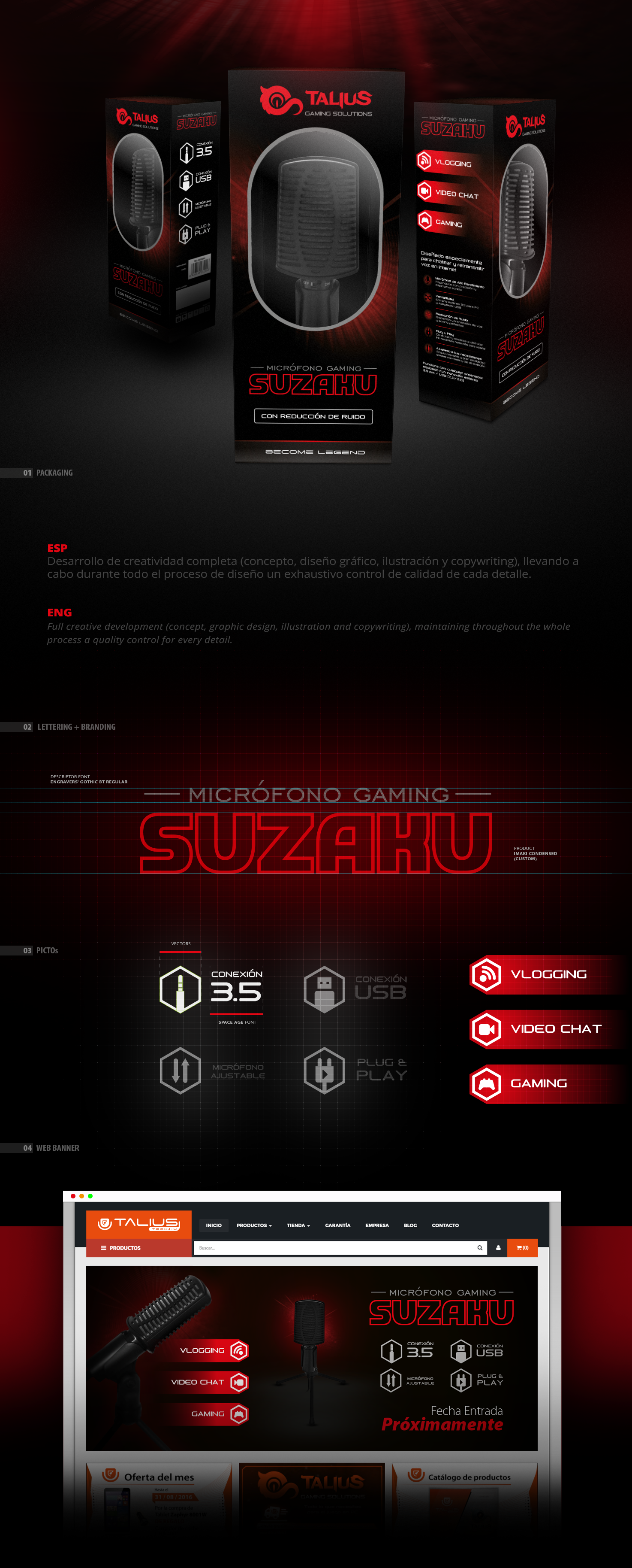
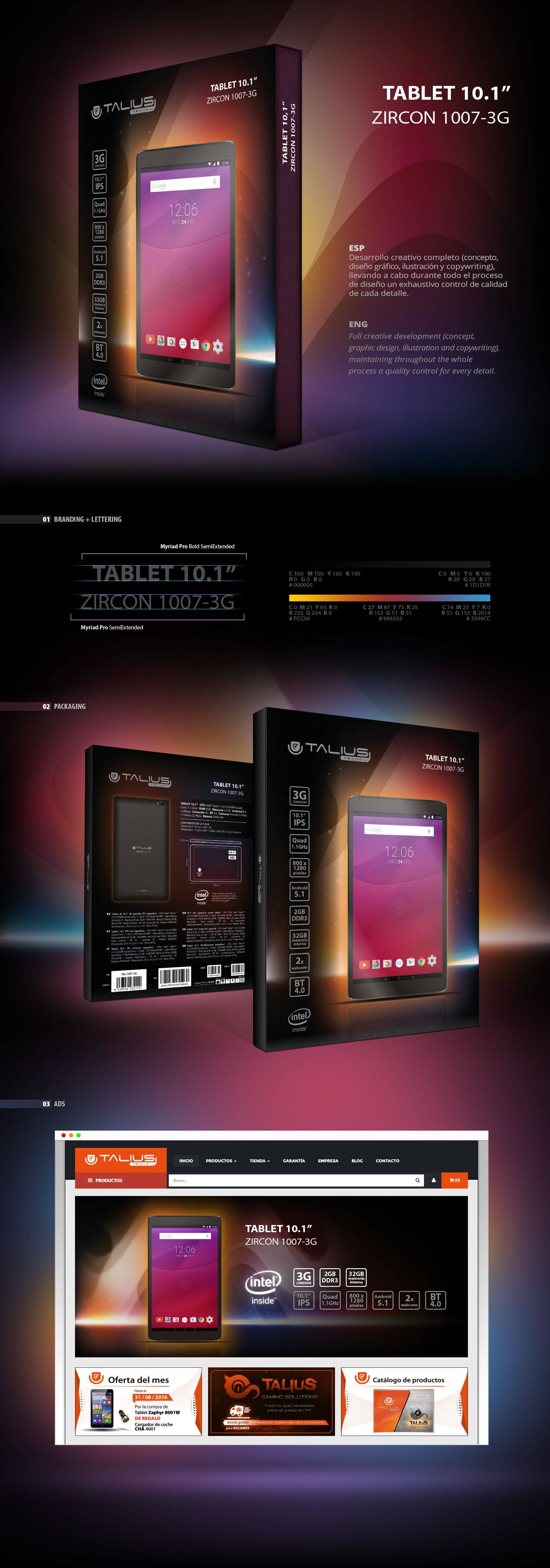
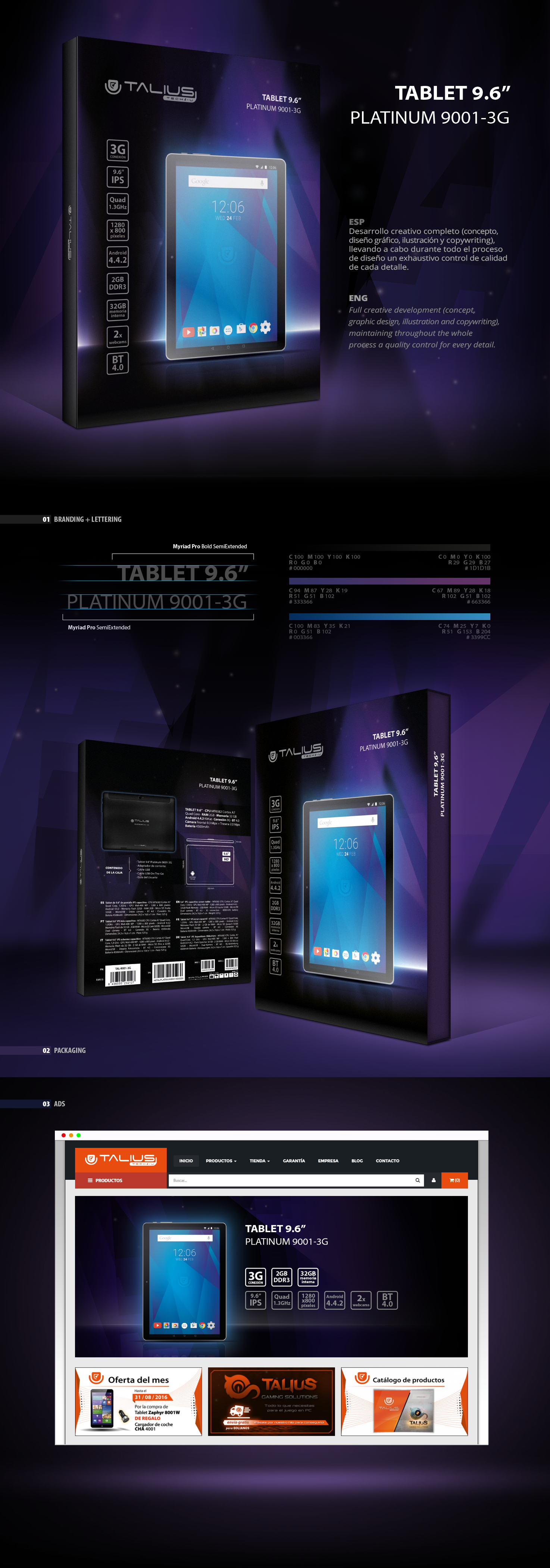
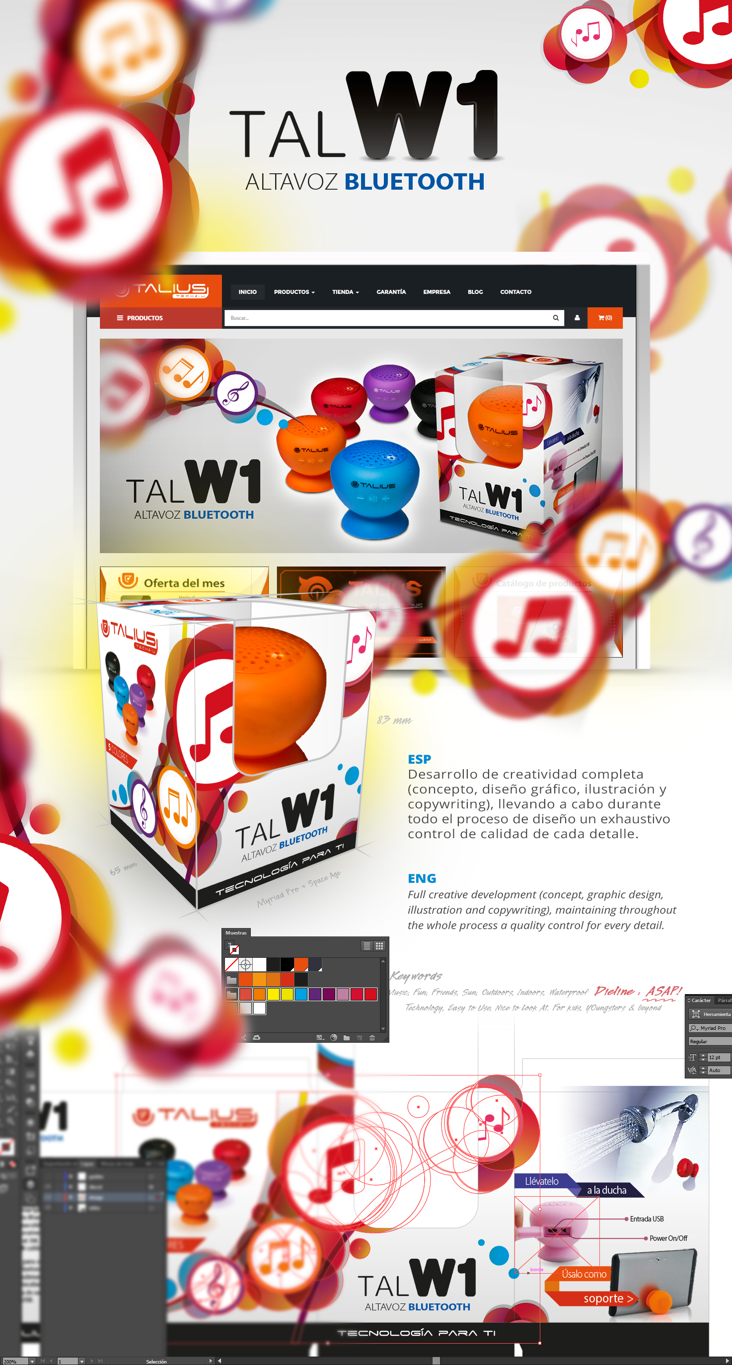
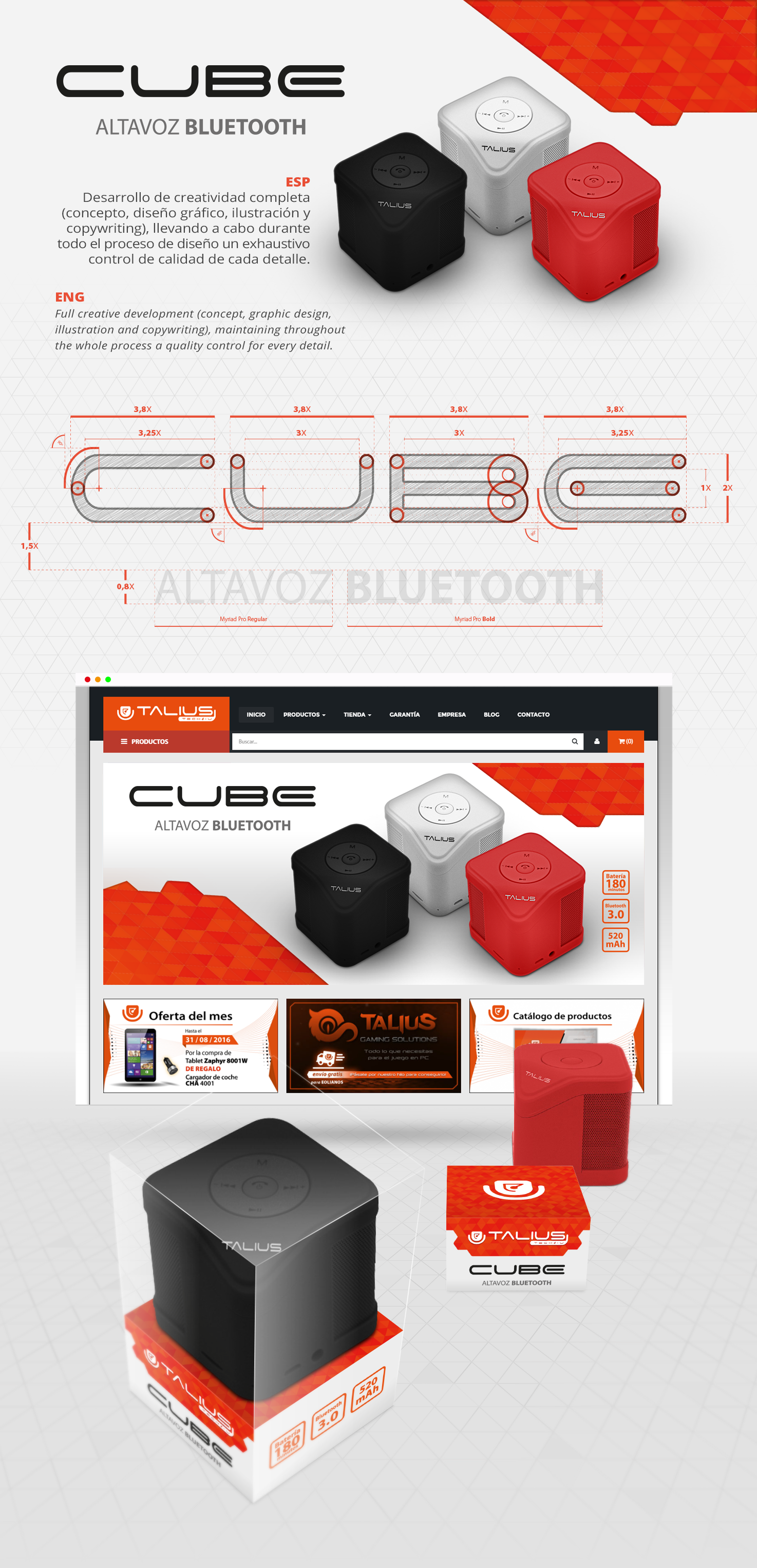
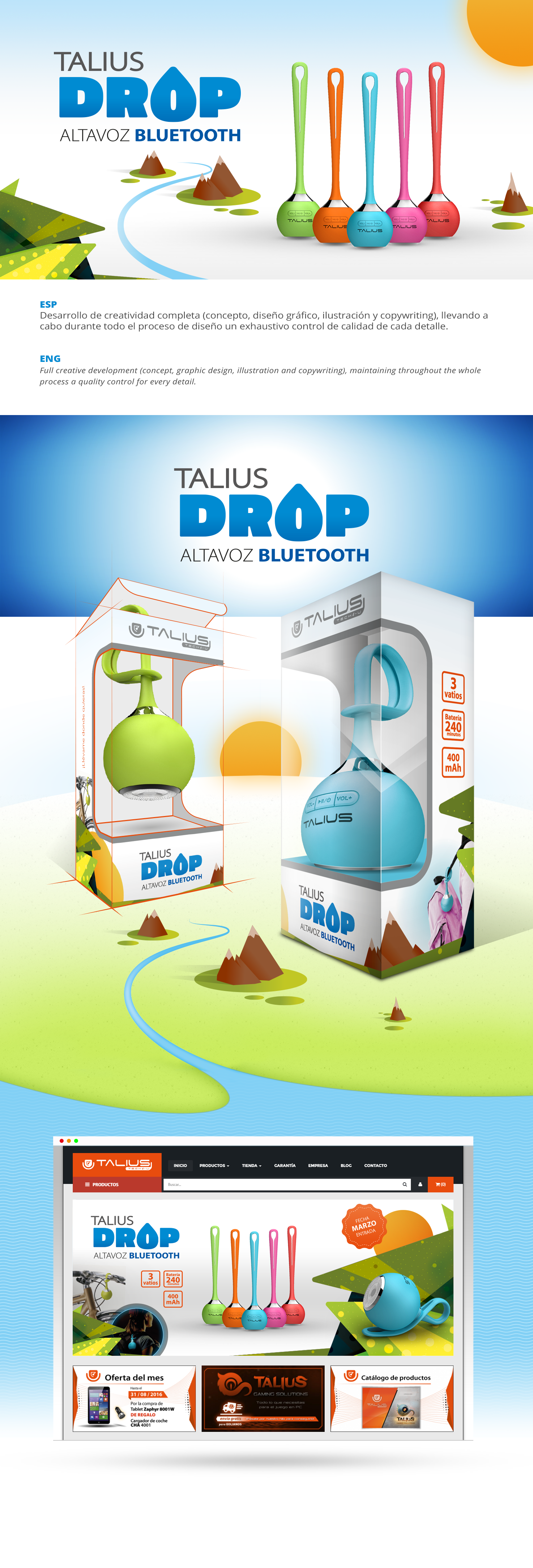
From November 2015 to September 2016, I joined Talius Technology (a Spanish brand focused on marketing online and in store tech products to a general, wide customer target) as a graphic designer, with hands also set on the copywriting in Spanish of simple commercial texts & its translation into English. But, most of all, my work there was all about coming up with attractive and creative packaging designs, since the key factor in the company's marketing strategy revolves around products appearance: applying an eye-catching design to any product packaging (as well as snapping a good set of photos of it) was essential.

SOLUTION

My duties at Talius Technology covered the whole range of tasks involved in the production and marketing of any product nowadays: from contacting the Asian supplier to collect further info on the product and its package diecut (overseeing their production works in China), to writing and translating into english the product's commercial description, generating also pictures for social media and in store applications (such as posters and catalogues) to help its marketing and positioning.

APPLICATIONS

When working on the packaging design of each product, I usually created and developed a visual style according to the product's appearance and commercial name, thus delivering every time a packaging with an unique branding, tailored to the particularities of each product. The whole process was always carried out in a mostly agile and fast process: often, the complete development of a product was allotted a maximum of 3 weeks.

PROJECT
CREDITS

CLIENT
Talius Technology
STAFF
Supervision Pablo Pineda
Art direction Pablo Pineda
Packagings designs (on products displayed) Alexis Cruzado
Branding & illustration Alexis Cruzado
TOOLS
Packagings designs Adobe Illustrator
Products llustrations Adobe Illustrator | Adobe Photoshop
Products photos Adobe Lightroom | Adobe Photoshop

TESLARADIO Packaging Design

SCHIZOPHONIES

Packaging Design | 2019

CONTEXT

On February 2019 I was commissioned by Chinowski Garachana (musician and sound hacktivist) to design the sleeve artwork for his album Schizophonies of a Gentrified City, a six-parts fragmented composition in which the author criticises the gentrification of the streets of Málaga's old town and the situation of culture and arts in the city.

SOLUTION

Provided with a structured set of graphic resources from the artist and entrusted with absolute creative freedom, I designed a sleeve's art aligned with the album's sound concept: a minimalist collection of tracks made of drones, grainy textures and field recordings from the streets of Málaga.

APPLICATIONS

Light, grainy and almost atonal on the outside; dark, enriched with text and pictures but still minimalistic on the inside, the whole design process for this project took just two weeks for its completion (plus an extra week for its print production): a CD in a cardboard sleek cover, with a folded inlet included inside.

PROJECT
CREDITS

CLIENT
Teslaradio, Oigovisiones Label
STAFF
Art direction Alexis Cruzado
Packaging design Alexis Cruzado
Sleeve art's pictures Chinowski Garachana et al.
Printing Directdisc
Label Oigovisiones Label
TOOLS
Packaging design Adobe Illustrator | Adobe Photoshop

TRANSDISCIPLINA A/V

TRANSDISCIPLINA A/V

Branding + design for live music & visuals collective | 2017 - Present

CONTEXT

Transdisciplina A/V is an audiovisual collective that, since 2016, curates live events in which generative art, electronic music and live visuals merge live.

As a close collaborator of the collective, my main tasks are to create the necessary advertising applications to spread the collective's events, as well as to design the key documents that communicate the project's 6 Ws (dossier, presskit) and help keeping its corporate image (brandbook) when applied in other groups' medias, such as brands and cultural institutions.

PROJECT
CREDITS

Art direction Alexis Cruzado, Alejandro Lévar
Logo design Pablo Pecino
Logo vectorization Alexis Cruzado
Design & illustration Alexis Cruzado
Web design & development Alexis Cruzado
Documents design & layout Alexis Cruzado
Motion graphics Alexis Cruzado

TRANSDISCIPLINA A/V Merchandising

TRANSDISCIPLINA A/V

Illustration + Graphic Design | 2018

CONTEXT

Transdisciplina A/V is an audiovisual collective that, since 2016, curates live events in which generative art, electronic music and live visuals merge live.

To help getting some direct revenues for the Collective (and, at a same time, to spread its brand in the streets and within the main social networks), I was entrusted the creation of some merchandsing items, which were sold at every Transdisciplina A/V's events.

SOLUTIONS

Merchandising items - tote bags, T shirts, badges and stickers, printed by some local and trusty partners - were designed to be sold at Transdisciplina A/V's live events.

PROJECT
CREDITS

CLIENT
Transdisciplina
STAFF
Art direction Alexis Cruzado, Alejandro Lévar
Designs & illustrations Alexis Cruzado
Tote bags & t-shirts printing Gran Bengala
TOOLS
Designs (T-shirts, tote bags, badges, stickers) Adobe Illustrator

TRANSDISCIPLINA A/V Branding

TRANSDISCIPLINA A/V

Brand Visual Development | 2017

CONTEXT

Transdisciplina A/V is an audiovisual collective that, since 2016, curates live events in which generative art, electronic music and live visuals merge live.

After the succesful string of 2016 season's events, its core members felt that some quality visual push (in particular, on its brand) was needed to help spreading the project. So, they called on my help to collaborate on this crucial task.

SOLUTION

Although the Collective's logo was not designed by me, I did its careful vectorization, so to ensure it could be perfectly displayed into any possible application - posters, websites, dossiers, invoices.

APPLICATIONS

To help preserving Transdisciplina A/V's corporate image, I designed a brief Brandbook meant to guide press media and institutions on how to apply the Collective's brand. Along came also a couple of documents - a Presskit and a Dosser - made to communicate the Collective's history and scope.

PROJECT
CREDITS

CLIENT
Transdisciplina
STAFF
Art direction Alexis Cruzado, Alejandro Lévar
Logo design Pablo Pecino
Logo vectorization Alexis Cruzado
Documents layout (Brandbook, Dossier, Presskit) Alexis Cruzado
TOOLS
Logo design Adobe Illustrator
Documents layout (Brandbook, Dossier, Presskit) Adobe InDesign

VS GAMERS Xmas 2019

VS GAMERS 2K19 XMAS

Art Direction, Graphic Design, Illustration | 2019

CONTEXT

There is nothing more unappealing for a centennial gamer than a classic Christmas sales campaign… But, what if we put Santa and the Three Wise Men to compete for VS Gamers fanbase's love through a contest? In which they'll be shown as vulnerable and longing for emotional support... And, to put the icing on the cake, what if in that contest we were giving away to VS Gamers fanbase a full gaming setup and special discounts on selected brands? Campaign's concept, set!

SOLUTION

Setting the campaign's tone was a work I shared with Atlas Informática Audiovisual Dept.: prior to start filming and designing anything, we decided how every character should look and act like in the push videos which would be the campaign's main assets: Santa, the magic man in a sorry state; the Three Wise Men, brothers in arms (and at permanent war).

APPLICATIONS

With a proper plot and both characters' and campaign's look & feel set, the main effort was to shoot a couple of videos for social media networks, which should act as a hook to funnel VS Gamer's fanbase and further audience to a landing page in which they could vote for the character they loved the most. To help pushing even more the difussion of this campaign, I designed too a wide set of banners and pictures to be published in blogs, websites and social media ads.

Santa promo video   click on pic

Kings promo video   click on pic

PROJECT
CREDITS

CLIENT
VS Gamers, Atlas Informática
STAFF
Art direction Marta Hita, Daniel Ortiz, Alexis Cruzado
Characters design Daniel Ortiz, Fran Pezzo, Alexis Cruzado
Conceptual design & illustration Alexis Cruzado
Design application Fran Pezzo, Daniel Ortiz, Alexis Cruzado
Web design Alexis Cruzado
Web development Antonio Baena
Motion graphics Alexis Cruzado
Promo videos Daniel Ortiz
Video shootings Daniel Ortiz, Fran Pezzo
Video postproduction Daniel Ortiz
Characters photoshootings Fran Pezzo
Characters photos edition Fran Pezzo
TOOLS
Visual concept (characters, letterings, colour palette) Adobe Illustrator | Adobe Photoshop
Characters photos Adobe Lightroom | Adobe Photoshop
Motion graphics Adobe Photoshop | Adobe After Effects
Videos Adobe Premiere Pro | Adobe After Effects
Landing page design Adobe Photoshop
Landing page development Bootstrap | Visual Studio | HTML5 | CSS3 | JavaScript

Navegación de entradas

1 2 3 4 5
Volver arriba